미국 로스앤젤레스에 기반을 둔 영화 후반 작업 전문 스튜디오 ‘Church’가 브루클린 디자인 스튜디오 Porto Rocha와 협업해 새로운 브랜드 정체성을 공개했습니다.
Church는 브라질 출신의 수상 경력 편집자 마 페라즈가 설립한 스튜디오로, 나이키, 스포티파이, 캘빈 클라인, KFC, 푸마 등 글로벌 브랜드와 메간 더 스탤리언, 페기 구 등의 아티스트와의 협업을 통해 이름을 알렸습니다.
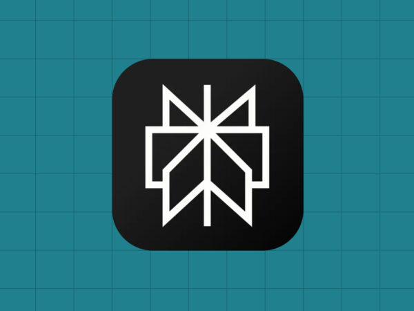
이번 리디자인은 이름처럼 ‘성당’을 연상시키는 독특한 로고에서 출발합니다. 성당 첨탑을 올려다볼 때 느껴지는 비대칭 수직 구조를 표현한 로고는, 다양한 시점에서 로고를 분절하고 재배치함으로써 ‘새로운 관점’을 전달합니다. 이는 Church가 가진 영상 편집 철학, 즉 이야기의 분위기와 의미를 재구성하는 작업과 맞닿아 있습니다. 영상 기반 스튜디오답게 모션 디자인을 핵심 요소로 삼고 있으며, 확대·기울기·회전 등 움직임을 통해 편집자의 다양한 시선을 시각적으로 구현했습니다.
타이포그래피는 기술적 감각을 살린 모노스페이스 폰트와 대담한 헤드라인용 서체를 조합해 표현과 가독성의 균형을 맞췄습니다. 컬러는 흑백, 형광 연두, 디지털 블루로 구성되어 절제된 가운데 시각적 힘을 유지합니다.
컬러 팔레트는 검정, 흰색, 형광에 가까운 연두색, 그리고 간헐적으로 사용되는 파랑색으로 구성되어 절제미를 유지하면서도 시선을 사로잡습니다. 이 중 파랑색은 디지털 시대의 이브 클라인 블루를 연상시키는 색조로, 화면 구성을 돕는 프레임 역할도 합니다.