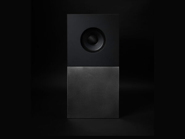
마이크로소프트가 Koto와 협업한 사이버보안 브랜드 ‘Microsoft Security’의 새로운 브랜드 아이덴티티입니다. 이번 리브랜딩은 단순한 위협 대응을 넘어 위협을 선제적으로 감지하고 방지하는 미래지향적 철학을 시각적으로 구현하는 데 집중했습니다.
이번 정체성은 전통적인 보안 상징인 자물쇠, 방패, 어두운 색채에서 과감히 벗어나 명확하고 자신감 있으며 생동감 있는 시각 언어로 전환되었습니다. 마이크로소프트는 이를 통해 보안이란 사용자가 신뢰하고 안심할 수 있는 경험이어야 한다는 메시지를 전달하고자 했습니다.
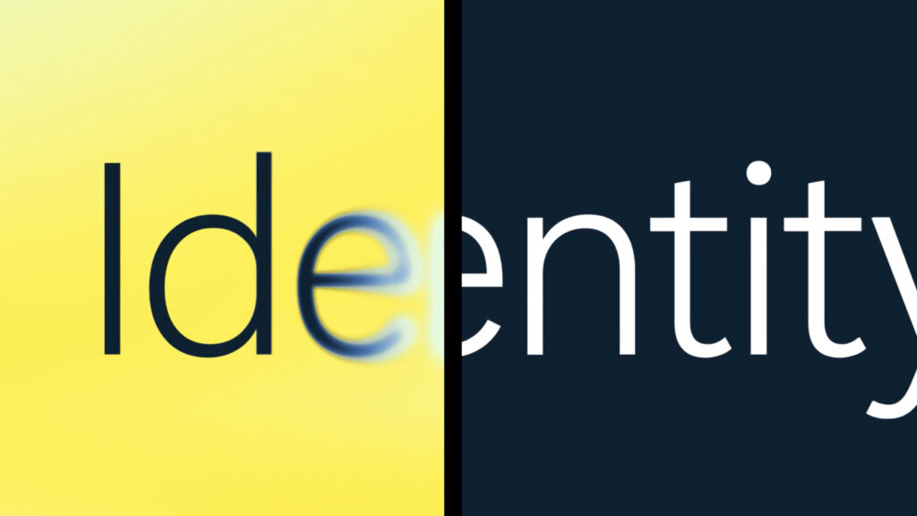
브랜드의 핵심 그래픽 시스템은 ‘스캐닝 효과’에서 출발합니다. 이는 이미지 스캔 기술에서 영감을 받은 요소로, 숨겨진 위협을 탐지하고 보이지 않던 위험을 시각적으로 드러내는 역할을 합니다. 마이크로소프트 고유의 컬러 팔레트를 바탕으로 다양한 환경에 적응하며 정보의 중요도를 강조하고 몰입감을 높이는 효과를 냅니다.
타이포그래피 역시 주목할 만합니다. 기본적으로는 마이크로소프트의 시그니처 서체를 유지하되 스캐닝 효과와 결합하여 키워드를 강조하고 시선의 흐름을 유도하는 방식으로 설계되었습니다. 시각적 리듬과 정보 전달력을 동시에 확보한 것입니다.
UI와 데이터 시각화 요소도 이러한 시스템에 기반해 설계되었습니다. 인터페이스 곳곳에 스캐닝 메커니즘이 적용되어 정보의 깊이를 더하고 기술적 정교함을 표현합니다. 단순한 데이터도 상호작용적이고 독특한 사용자 경험을 유도합니다.
이번 아이덴티티는 디지털을 넘어 오프라인 환경에서도 일관되게 적용됩니다. 브랜딩 시스템은 실내외 전시 공간, 제품 포장, 인쇄물 등 다양한 접점에서 빛과 에너지를 발산하며 브랜드의 내러티브를 완성합니다.
마이크로소프트 커머셜 브랜드 스튜디오와 보안팀은 이번 프로젝트를 통해 기술적 우위뿐 아니라 감성적 신뢰까지 포괄하는 새로운 보안 브랜드의 미래를 제시하고자 했습니다. 마이크로소프트는 이제 보안을 단순히 지키는 영역이 아니라, 투명하게 드러내고 능동적으로 대응하는 영역으로 정의하고 있습니다.