Lotus Biscoff가 로고를 리디자인했습니다. Lotus Biscoff는 가정에서 가볍게 먹는 비스킷으로 유명합니다. 1932년 벨기에에서 Jan Boone Sr.가 천연 재료를 이용해 카라멜화한 비스킷을 만든 데서 유래했습니다. 우리나라에서는 커피 과자라는 이름으로 널리 알려져 있죠. Biscoff는 이름부터 Biscuit과 Coffee의 합성어입니다.
로터스 베이커리의 관리자 Frances Booth는 고객이 ‘작고 빨간 비스킷’을 Biscoff라고 부른다는 것을 발견했습니다. 브랜드의 확장 전략에 발 맞춰 Lotus Biscoff는 Biscoff를 강조되도록 로고를 리디자인했습니다.

손으로 쓴 것 같은 필기체 느낌의 서체에서 눈에 띄는 두껍고 둥근 서체로 바뀌었습니다. 글꼴의 끝과 꺾임은 비스킷처럼 투박하게 둥근 형태입니다. 기하학적인 형태를 그대로 따르지 않고 조금씩 변형됐습니다. 시선의 흐름을 만드는 완만한 곡선이 미소처럼 느껴집니다. 노골적으로 유도하는 선 없이 자연스럽게 인상을 설계했습니다.
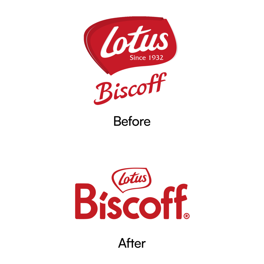

누가 보더라도 바로 알 수 있는 붉은 색과 비스킷 형태는 유지됩니다. Biscoff보다 Lotus를 기억하는 경우도 많았기 때문에 새로운 워드마크에 Lotus 마크도 포함됩니다. Lotus를 배경색 없이 선으로만 표현하고 Biscoff를 속을 채워 대비가 됩니다.

아이스크림, 제과 뿐만 아니라 Lotus Biscoff 제품까지 확대될 것이라 밝혔습니다. Created With Lotus Biscoff는 맥도날드, 크리스피 크림, 코스타, 시나본 등 브랜드와 협업한 사례가 있습니다. 맥플러리, 크리스피 도넛 등을 만들었습니다.
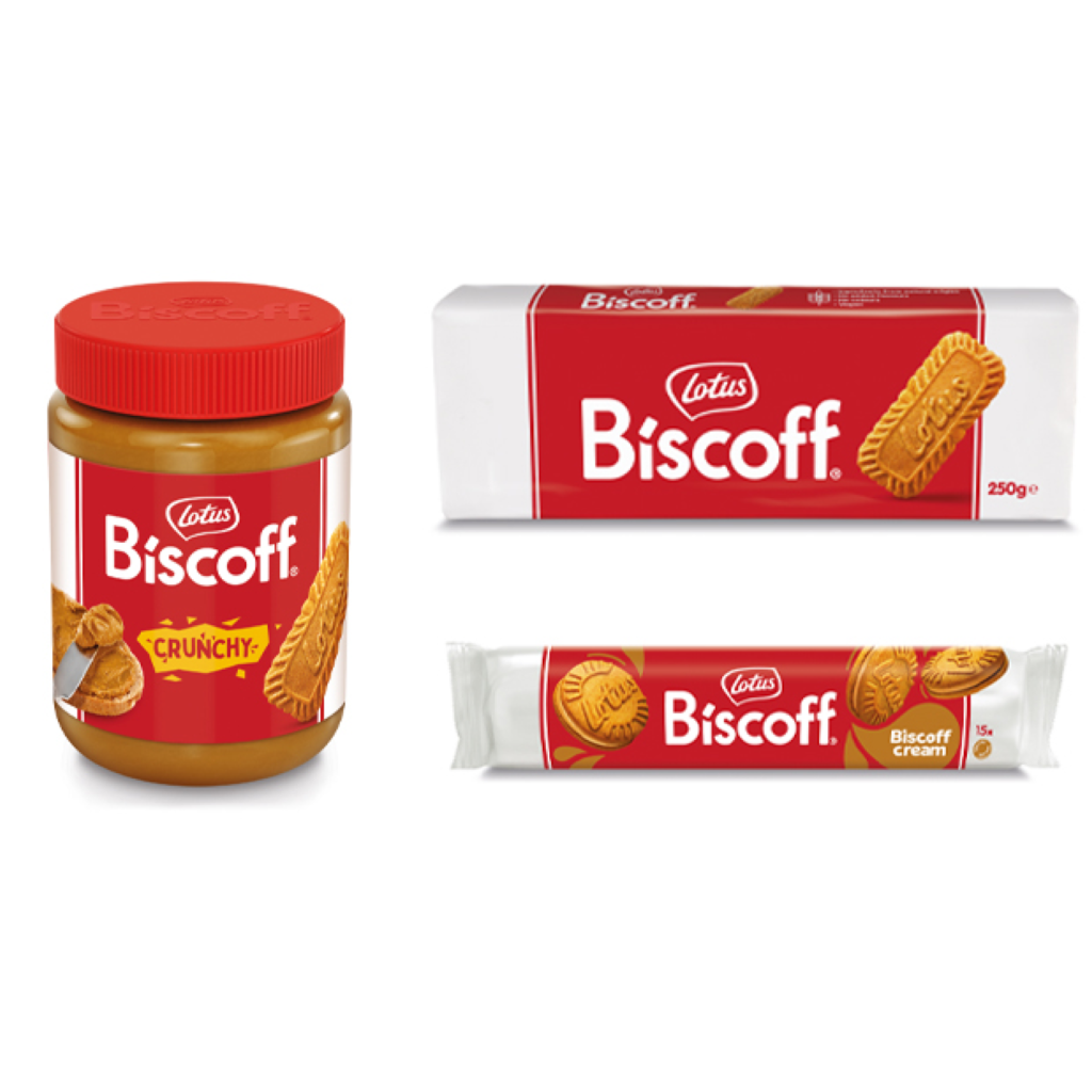
앞뒤로 비스킷이 살짝 보이는 붉은 띠 형태는 Lotus Biscoff의 가장 강력한 정체성입니다. 가장 중요한 자산을 유지하면서 새로운 환경에 적응하기 위한 노력이라는 생각이 듭니다. 기존 워드마크는 ‘Lotus’를 경쾌하게 휘감겨 올라가는 필기체 ‘Biscoff’를 보조했다면 새로운 워드마크는 ‘Biscoff’로 비스킷의 인상을 전하면서 ‘Lotus’가 보조하네요.