구글이 25주년을 맞이해 구글 두들을 공개했습니다.
구글 두들은 특별한 기념일이나 사건을 검색 엔진인 구글의 대문에 거는 것입니다. 자사의 워드마크인 ‘Google’을 다양한 이미지로 변형하거나 미니게임 등 이스터 에그를 넣기도 합니다.
세르게이 브린과 레리 페이지는 90년대 후반 스탠포드 대학에서 만났습니다. World Wide Web으로 세상이 긴밀하게 연결될 것이며 검색 엔진이 중요하리라 생각했습니다. 임대 차고에서 쉬지 않고 개발하며 1998년 9월 27일 Google Inc.가 탄생했습니다. 그리고 25년이 지난 지금 여전히 전 세계 수십억 명의 사람들이 정보를 보편적으로 접근가능하고 유용하게 만드는 사명을 유지하고 있습니다.
Google은 숫자를 표현하는 Googol을 변형한 것에서 시작했습니다. 처음 1995년 2년 BackRub이라는 임시 이름 이후에는 쭉 Google이었습니다.
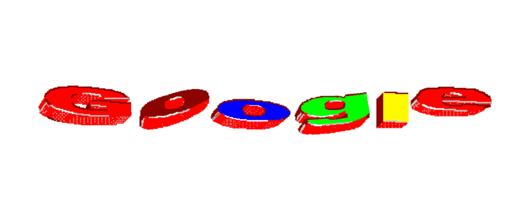
1997년 첫번째 구글의 베타버전에 쓰인 로고입니다. 입체적인 형광색은 당시 컬러 표현 트렌드가 보입니다. 적은 비트로 픽셀을 표현했던 어드벤쳐 게임이 떠오르는 색감과 입체감입니다.
1998년 공식 로고는 알록달록한 바스커빌 볼드로 쓰였습니다. 같은 해 후반에는 느낌표가 추가되었습니다. 야후를 의식한 것이 아니었을까요? 그라데이션을 더 세밀하게 표현할 수 있게 되면서 둥글고 부드러운 입체감을 표현했습니다.
1999년에는 Catull BQ 세리프 서체로 더 얇고 부드럽게 바뀌었습니다. 우아하게 뻗는 얇은 서체와 세리프가 특징적입니다. 색은 동일하며 ‘o’가 왼쪽으로 살짝 기울어졌습니다.
2010년 그림자가 사라지고 채도가 높아졌습니다. 스타트업에서 거대한 글로벌 기업으로 성장하던 시기입니다. 이전보다 해상도가 높아져 더 자연스러운 입체감이 들어갔습니다. 기술의 발전이 로고에서도 드러납니다.
2013년 색이 미니멀하게 바뀝니다. 구글은 사용자 경험을 간소하게 만들기 위해 노력했습니다. 이는 로고에도 반영됩니다. 로고를 드러내는 시각 표현을 최소한으로 줄입니다. 모바일 시대가 도래하며 작은 화면에서 표현하기 좋게 플랫한 디자인으로 바뀌었습니다. 세리프의 끝부분이 정교하게 다듬어졌습니다. 입체감을 표현하는 그라데이션이 사라지고 채도가 낮아졌습니다.
2015년 산 세리프로 바뀝니다. 시그니처 색 구성을 유지하면서 모든 서체가 바뀌었습니다. Muguet에 가까운 서체로 구글이 직접 제작한 Product Sans를 이용해 만들었습니다. 로고는 다양한 방식으로 적용됐으며 모바일 앱에 사용되는 ‘G’에도 적용되었습니다. 클래식하고 거대한 기업이 아니라 젊고 멋진 기술 기업으로 보이기 위함입니다.
IT의 성장과 함께 했다고 해도 과언이 아닌 구글의 역사를 한 눈에 돌아보니 감회가 새롭습니다. 간결하고 유용한 서비스의 대명사였던 구글. 구글이 새로운 서비스를 추가할 때마다 삶이 달라졌습니다. 지금은 너무나 익숙한 클라우드 기반 생산성 툴들과 캘린더, 지도는 혁명이었죠.
이런 대단한 혁신을 만들어 온 구글의 성장을 짦은 영상으로 느낄 수 있었습니다. 오랜 시간이 지나고 규모도 어마어마해졌지만 결코 따분하고 사악한 회사가 되지 않기 위한 노력이 읽혔습니다. 성장하던 시기의 분위기와 메시지가 담긴 것 같아 재미 있네요.