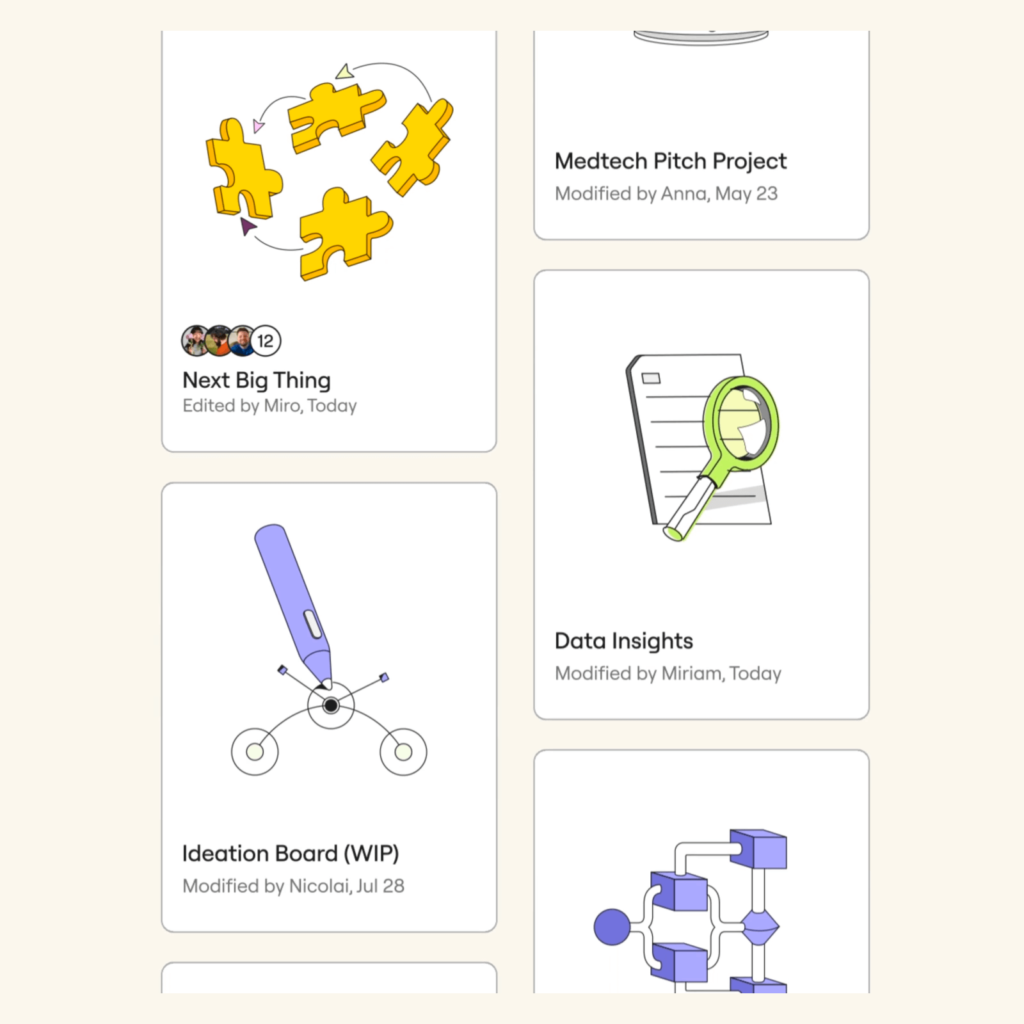
미로 Miro가 리브랜딩했습니다. 4년 전 네덜란드 디자인 에이전시 Vruchtvlees와 리브랜딩으로 멋진 시각 문법으로 깊은 인상을 남겼었습니다. 짧은 시간 안에 Miro는 전 세계 사람들이 사용하는 협업툴로 빠르게 성장했습니다. 이번에는 AKQA와 협업해 브랜드 정체성을 시각적으로 더 뚜렷하게 단단하게 구축했습니다.
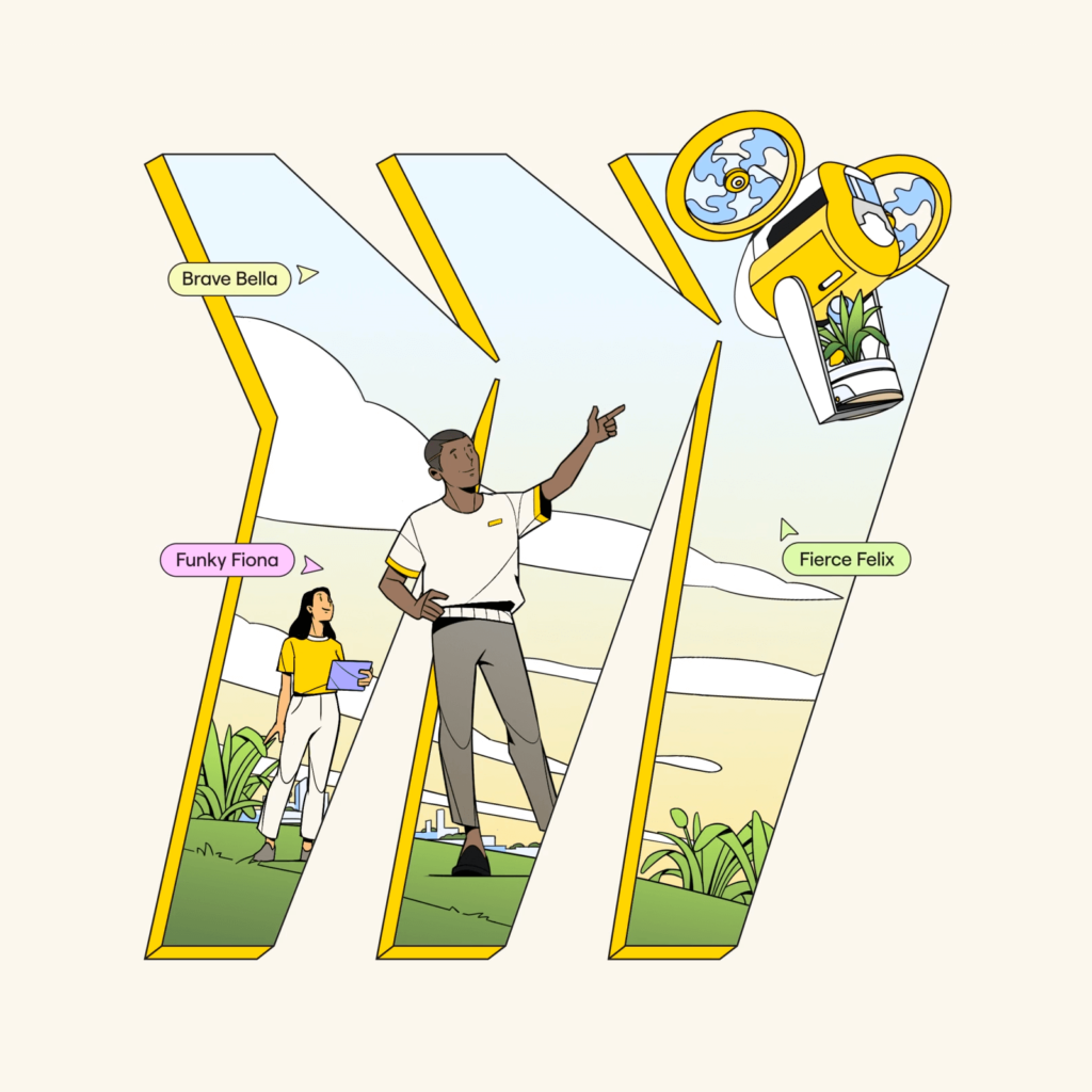
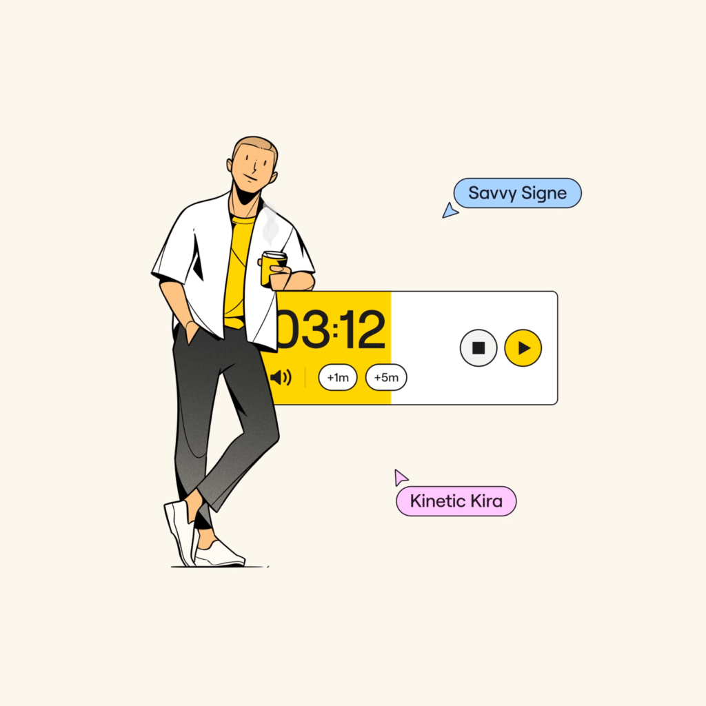
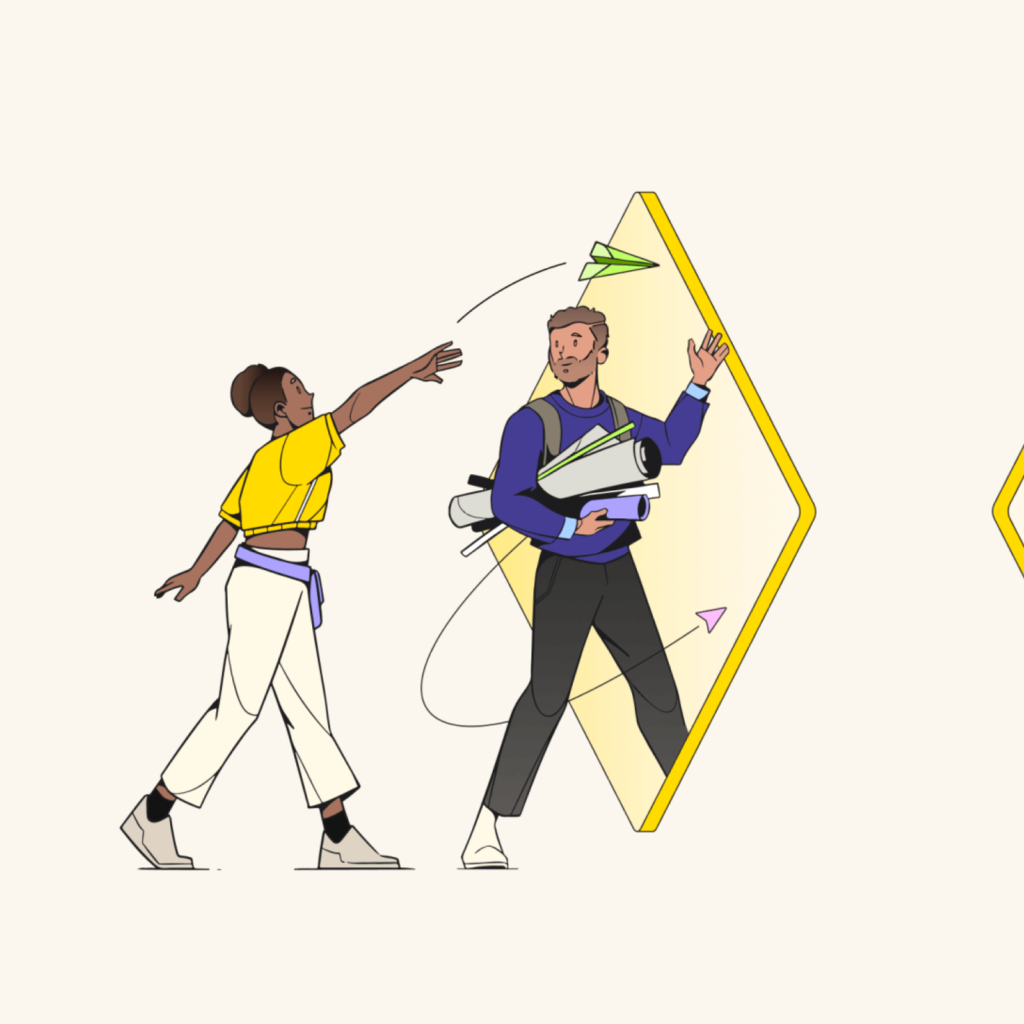
가장 눈에 띄는 미로만의 고유한 변화는 일러스트레이션입니다. 추상적인 개념보다는 구체적인 현실을 따뜻하게 묘사합니다.
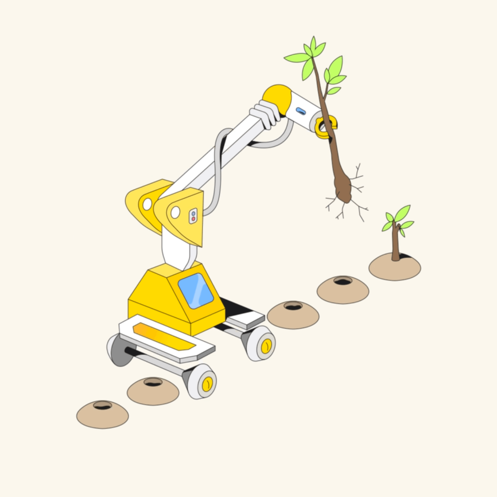
나무를 심는 로봇, 야쿠르트를 팔 것 같은 배송봇, 건물을 짓는 로봇 팔 처럼 앞으로 미래에 생길 모습을 구체적으로 묘사합니다. 미로의 상징적인 노란색을 중심으로 편안한 색감을 전합니다. 얇은 외곽선은 해상도를 더 뚜렷하게 만듭니다.

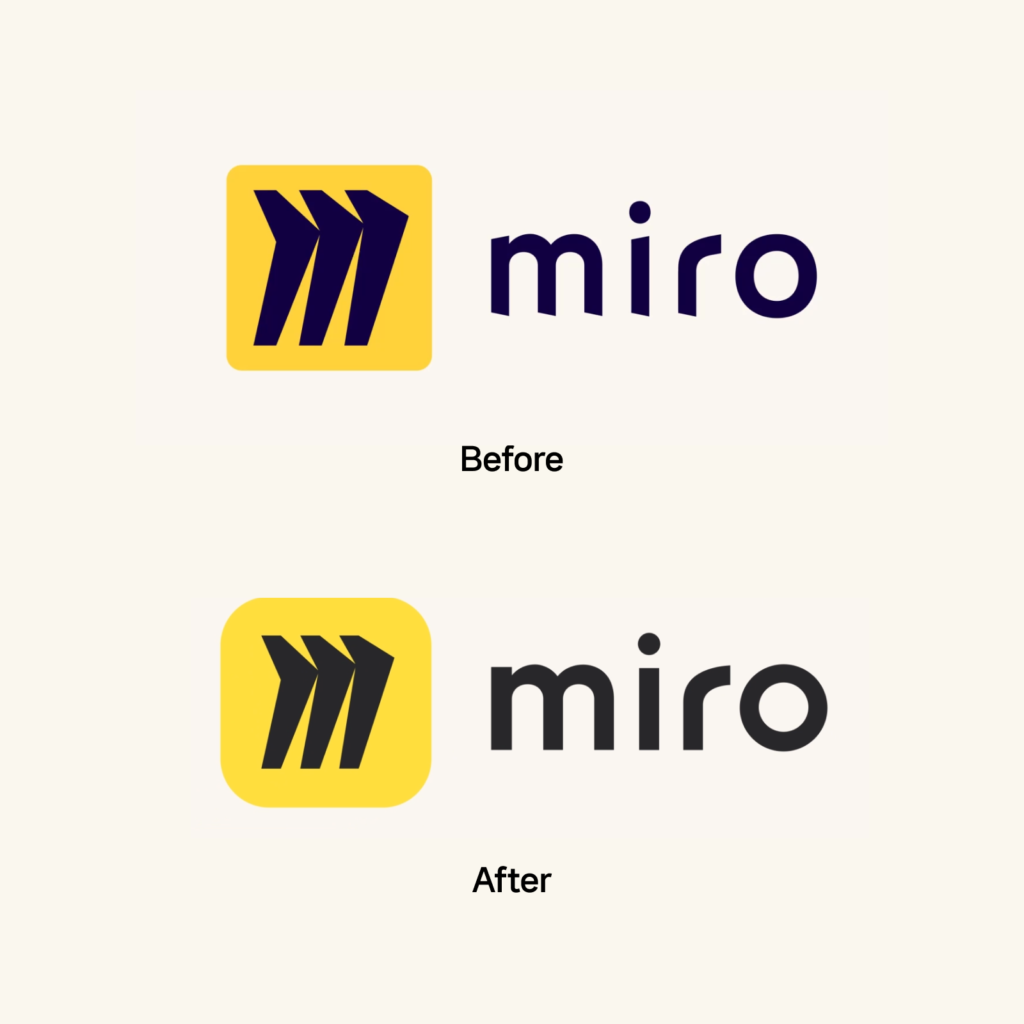
심볼의 외곽선을 둥글게 만들고 충분한 여백을 주어 독창적인 M 심볼에 더 집중할 수 있게 바뀌었습니다. 미끄러지는 듯한 워드마크의 바닥 부분은 수평으로 바뀌어 더 안정적으로 보입니다.
Roobert Pro 서체의 맞춤형으로 120개 언어를 지원합니다. 전체적으로 수평선이 도드라지는 서체입니다. g의 꼬리나 s, t에서 작고 둥근 인상이 보입니다.
미로는 작년 디자인 툴 설문 조사에서 압도적 1위를 차지했던 협업 도구입니다. 성공적인 브랜딩으로 성장을 만들어 낸 좋은 사례 중 하나입니다. 이번 개선도 뻔하지 않은 방식으로 자신들만의 성격을 잘 드러낸 것 같습니다.
다만 Miro가 어느 방향으로 성장할지 궁금해집니다. 시각화 영역은 피그마가 피그잼이라는 도구에 많은 투자를 하고 있고 회사 협업 툴은 아틀라시안과 같은 강자들이 쟁쟁합니다. 미로만의 성격이 드러나긴 했는데 독점적인 자신만의 인상을 어서 구축해야하지 않을까 생각이 드네요.