콘텐츠로 건너뛰기
₩
0
0
Cart
매거진
아티클
아카데미
스토어
매거진
아티클
아카데미
스토어
전체
Plus
로그인
로그인
₩
0
0
Cart
케이스 스터디
,
아티클
네이버 블로그 앱 톺아보기
2025-09-18
박종민 씀
플러스 멤버십 전용
Design Compass+
프리미엄 콘텐츠 무제한 접근
아카데미, 스토어 혜택
이벤트 우선 참가 및 할인
디자인 데이터베이스
첫 구독 7일 내 무료 취소
이미 구독 중이신가요?
로그인
박종민
Linkedin
Instagram
Youtube
프리랜서에서 유니콘급 스타트업 헤드 오브 디자인까지. 18년 넘게 브랜드와 프로덕트를 디자인하며 임팩트를 만들어 왔습니다. 현재는 디자인 나침반 CEO이자 편집장으로서 비즈니스 임팩트를 내는 디자인을 연구하고 있습니다.
최근 아티클
Plus
구글 스티치, AI로 초안 넘기기
26. 03. 11
케이스 스터디 · 아티클
Plus
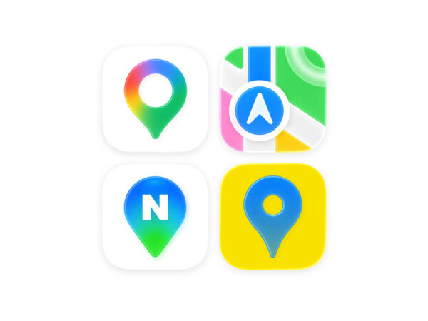
초정밀 지도 허용과 글로벌 지도 서비스 침투
26. 03. 09
프로덕트 · 아티클
Plus
F1 레이싱 팀 브랜딩 10
26. 02. 27
브랜드 · 아티클
Plus
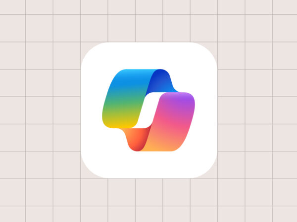
코파일럿, 엔터프라이즈를 위한 AI
26. 02. 25
케이스 스터디 · 아티클
Plus
AI FOMO 폭풍 헤쳐 나가기
26. 02. 23
아티클 · 인사이트
Plus
AI로 망한 브랜드와 흥한 브랜드
26. 02. 20
브랜드 · 아티클
Plus
빗썸 오지급 사태와 UX 디자인
26. 02. 19
아티클 · 인사이트
Plus
발렌타인의 맛, 초콜릿 브랜드 5
26. 02. 13
브랜드 · 아티클
아티클 홈
매거진
아티클
N
아카데미
N
스토어
컨설팅
매거진
아티클
N
아카데미
N
스토어
컨설팅
로그인
플러스 멤버십 가입
컨설팅
브랜드
라이브러리
컨설팅
브랜드
라이브러리
Please leave this field empty
디자인 나침반 뉴스레터
(필수)이용약관, 개인정보처리방침에 동의합니다.
(필수)광고성 정보 수신에 동의합니다
이용약관
개인정보처리방침
마케팅수신동의
정상적인 주소인지 확인하는 이메일을 보냈습니다. 받은 이메일에서 '활성화' 버튼을 눌러주세요.
Design for Business
비즈니스 임팩트를 위한 디자인 인사이트
최고의 디자인으로 성공한 기업 분석
브랜드, 프로덕트 산업 동향 분석
로그인
무료 체험하기