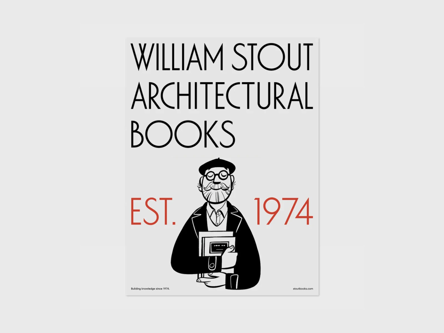

샌프란시스코 잭슨 스퀘어에 위치한 William Stout Architectural Books의 리브랜딩 프로젝트입니다. 윌리엄 스타우트는 지난 50년간 건축 전문서적과 디자인 서적, 자재 매뉴얼까지 아울러 다뤘습니다. 2022년 임스 연구소(Eames Institute for Infinite Curiosity)에 인수되며 새 출발을 준비했고, 이를 계기로 조니 아이브가 이끄는 디자인 스튜디오 LoveFrom이 새로운 그래픽 아이덴티티 개발에 나섰습니다.
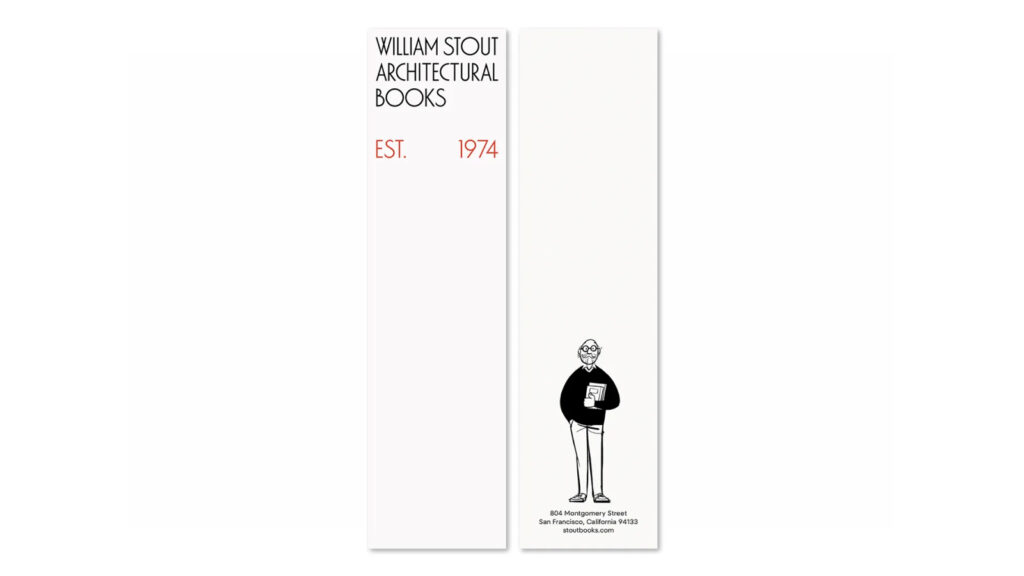
LoveFrom은 서점의 기존 간판에서 힌트를 얻어 ‘LF Washington’이라는 맞춤형 서체를 개발했습니다. 이는 1970년 호주 디자이너 러셀 빈이 제작한 아르데코풍 글꼴 ‘Washington’을 기반으로 하며, LoveFrom의 안토니오 카베도니가 중심이 되어 시각적 조화를 높이고 건축적 무게감을 더했습니다. 일부 문자에는 프랭크 로이드 라이트의 모노그램에서 착안한 합자가 적용되어, 기능성과 위트를 동시에 담았습니다.
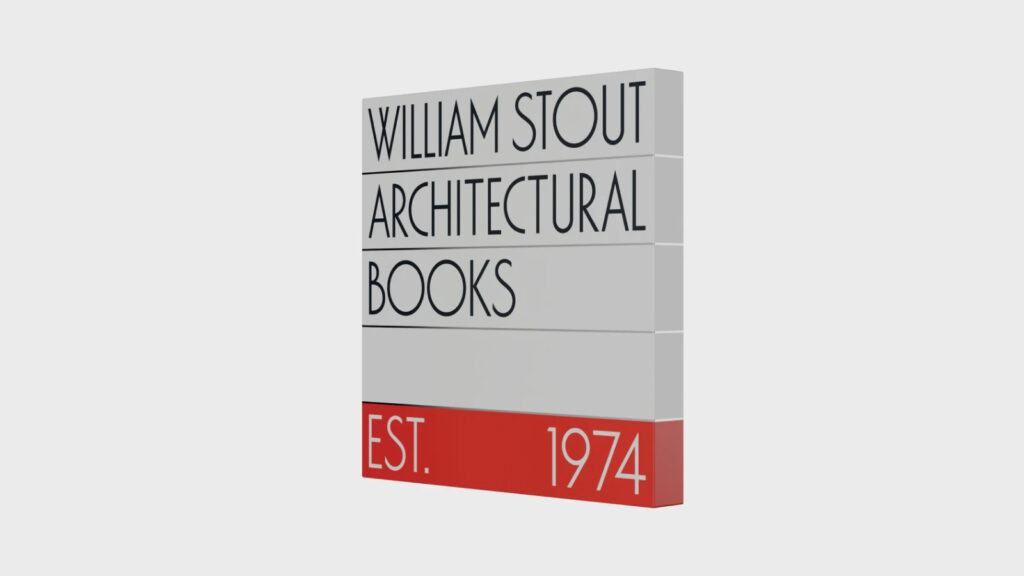
간판은 빨간 막대가 하단에 강조된 사각형 디자인으로 제작되었으며, 광택 있는 스테인리스 스틸과 에나멜 마감으로 건축적 질감을 표현했습니다. LoveFrom은 본래 간판 색상인 블랙과 화이트, 레드를 유지하면서도 르 코르뷔지에의 색상 연구에서 영향을 받은 확장된 팔레트를 함께 적용해 실내외 정체성을 통일했습니다.
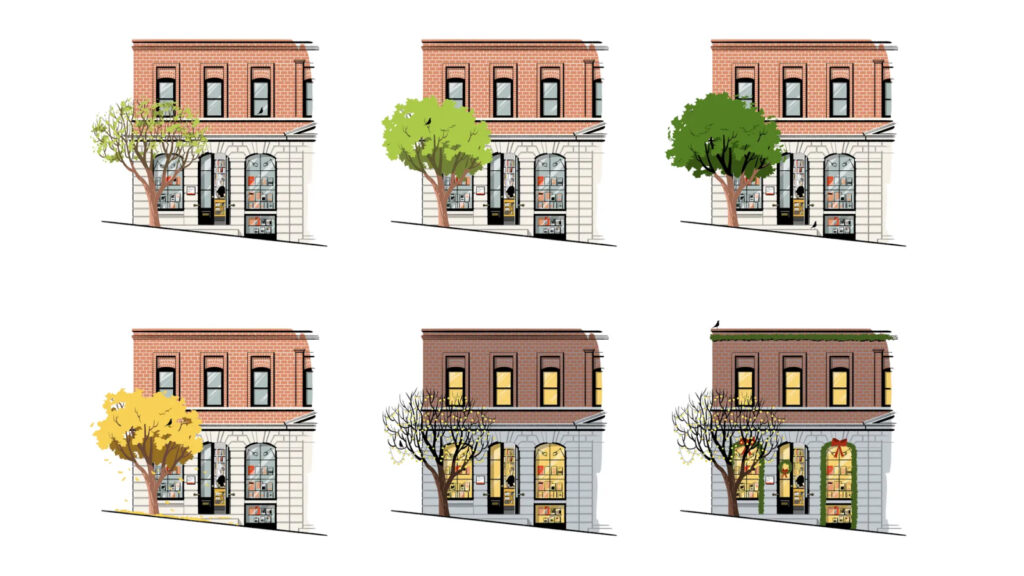
온라인 UX도 재설계되었습니다. 일본 일러스트레이터 하시모토 사토시가 제작한 계절별 매장 일러스트는 방문 시간에 따라 문이 열리고 닫히며, 상징적인 은행나무와 임스 하우스 버드를 통해 온라인과 오프라인 경험을 자연스럽게 연결합니다. 이스터 에그 형태의 새를 클릭하면 임스 연구소로 이동하는 기능도 포함되어 있습니다.